Instaheadshots - Making of an AI Professional Headshots Generater
Team
1 PM, 1 Engineer, 1 Designer, 1 ML Engineer
Tools
Figma, Jitter
Platform
iOS, Android, Web
Year
2023-2025
My Role
Sole Product Designer
The second product I ever designed. One tool, one job: turn your selfies into professional headshots in 15 minutes. I joined InstaHeadshots as its founding designer after Magic Studio, a different company, a different problem, but the same constraint. A technical team, an AI model, and no prior product or design language. The core challenge wasn't generation quality. It was trust. Getting someone to upload their face, wait, and pay for something they couldn't see yet. We flipped that designed a flow where you see everything before you spend a dollar. That one decision shaped the entire product.
Scope of Work
Starting Point
Before the product, there had to be a world for it to live in
The visual language had one job: make a brand-new AI product feel trustworthy enough that a stranger would upload their face to it. That meant clean, confident, and calm. A deep navy as the anchor. A single blue accent for action. Generous white space, because clutter reads as "startup that might disappear next month."
And the logo? We needed one out the door, so we shipped one. It did its job. We don't need to talk about it. Every founding designer has one of these, and the secret is knowing which battles to fight in a three-week sprint and which to let go.
THE PROBLEM
The hard part wasn't the tech, it was the ask: we needed strangers to hand over a dozen photos of their face and their money, all before we'd shown them a single result
THE FIXES
Three-week sprints. Design, ship, watch, fix, repeat.
There was no luxury of a six-month research phase. The rhythm was simple and relentless: design a piece of the flow, ship it, watch how real users behaved, and fix what broke. Every three weeks, sometimes less.
This wasn't a compromise. For a product in a category this new, it was the only honest way to design. We couldn't have predicted that users would panic at the photo upload rules, or that "show results before paying" would become the single most praised thing about the product. We learned both by shipping and watching.
Knowing when to reduce friction turned out to be as important as knowing how to manage it. The model got smarter; my job became getting out of its way.
THE FIXES
So how do you actually make a stranger trust you?
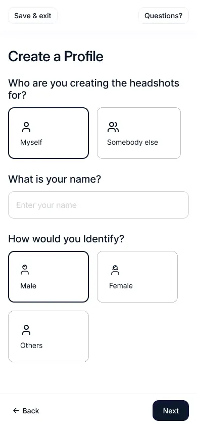
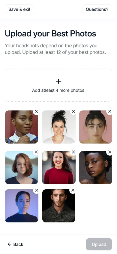
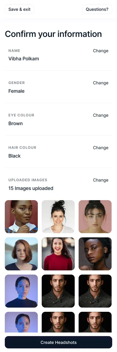
What follows is the creator flow as a user experiences it, from the first screen to the moment they pay, with the thinking behind each decision. Mobile web is woven in where it matters, because most people curate 12 photos of themselves from their camera roll at 11pm, not from a laptop.
Mobile-Web was designed simultaneously
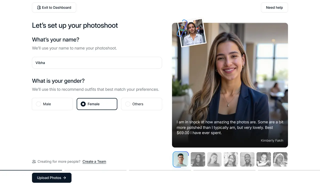
Answering a user's worry before they voice it is one of the quietest, most effective moves in conversion design.
As users enter their name, a rotating Trustpilot quote shows up right when they might feel unsure, because social proof works best when it quietly builds trust instead of trying to sell.
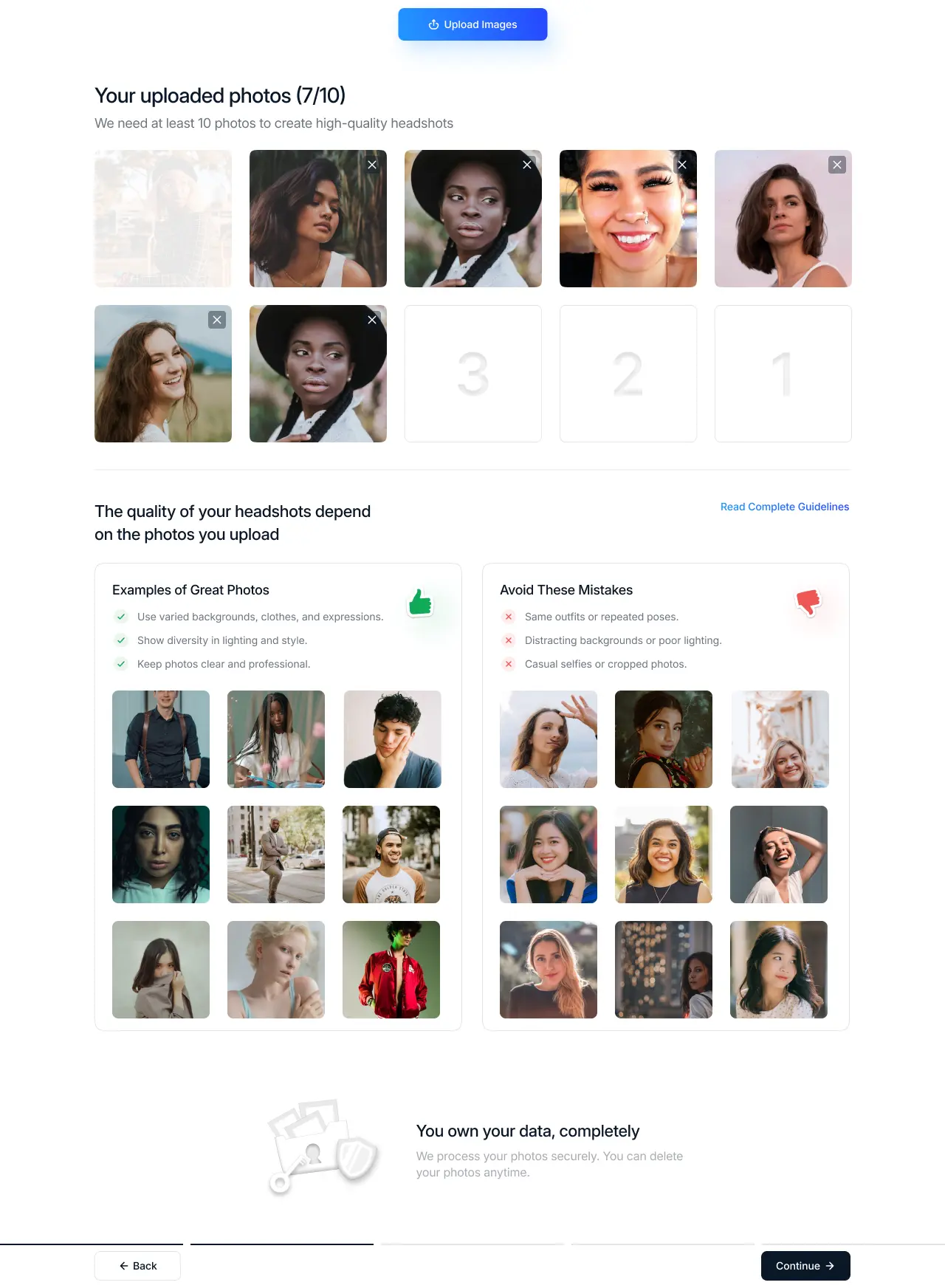
INTERACTION DESIGN · PROGRESS
Endowed progress effect: showing what remains makes completion feel closer and more achievable.
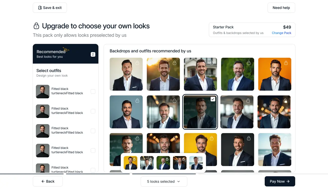
PRICING
Pre-selecting a premium plan with live feature previews and social proof reduces decision paralysis and lowers cognitive load during comparison.
PERSUASIVE DESIGN · CONVERSION
Loss aversion: the discomfort of losing visible access is stronger than the pleasure of gaining something abstract.
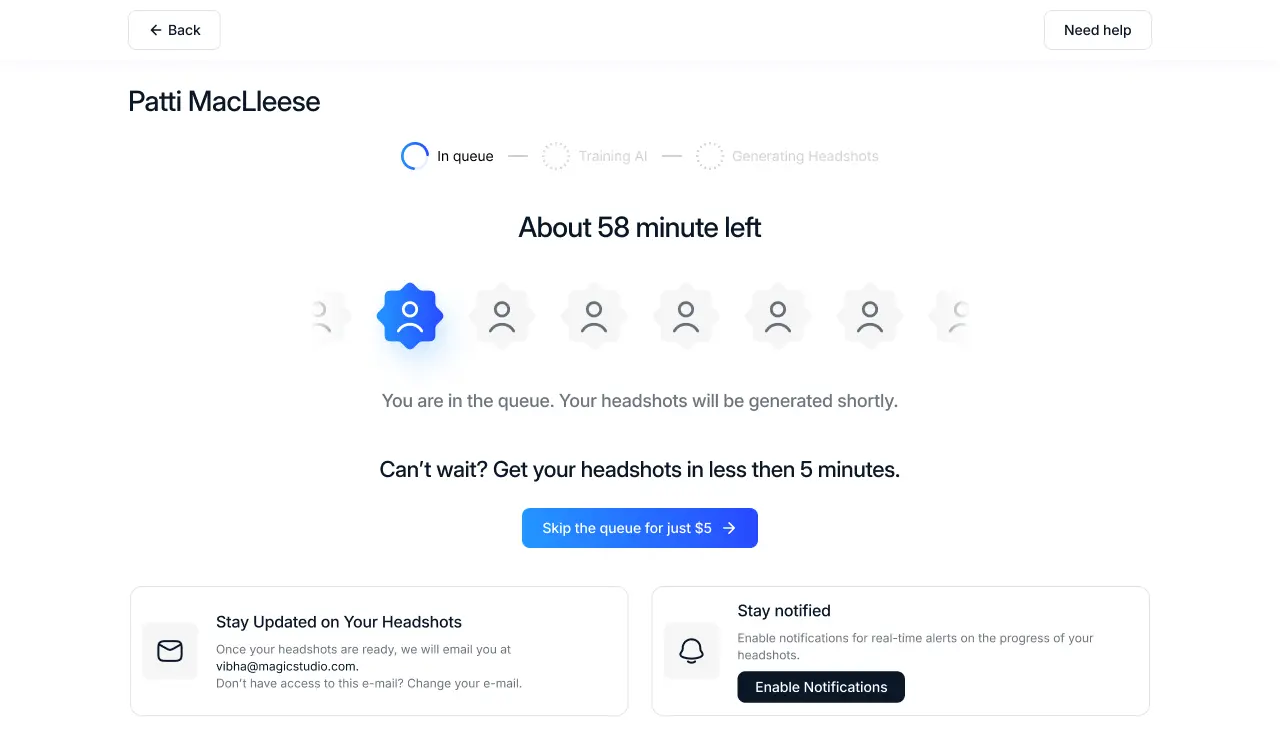
PERCEIVED WAIT TIME
Maister's Law: uncertain waits feel longer than known waits. Showing position in queue is a design intervention, not just a UI detail.
PEAK-END RULE · DELIGHT
Users judge an experience by its peak moment and its ending. This screen is designed to be both.

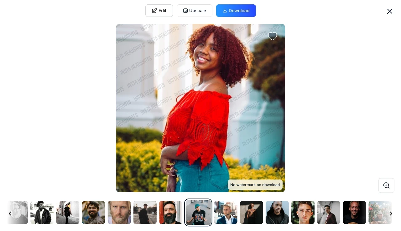
TRUST DESIGN · CONVERSION
Conversion at the payment step is a trust problem, not a UI problem. The form is Stripe-standard. The design work is everything surrounding it.

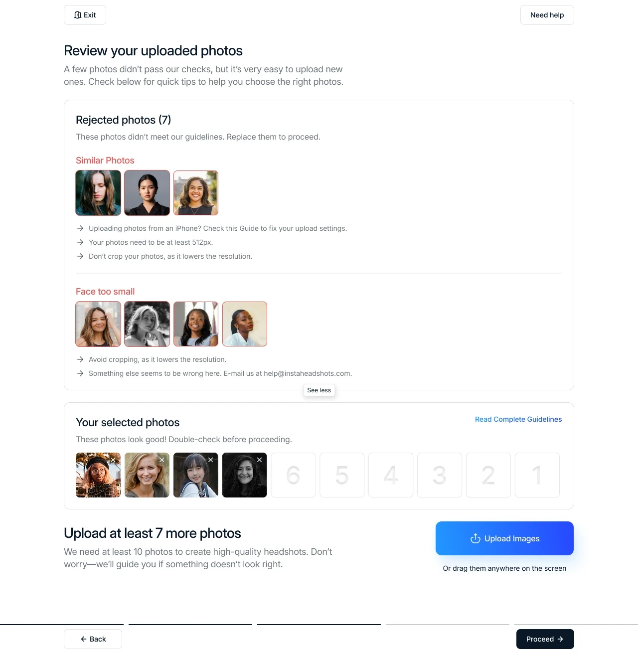
ERROR DESIGN · HCAI
Telling someone why something failed, not just that it failed, is what separates a system that helps from one that judges.
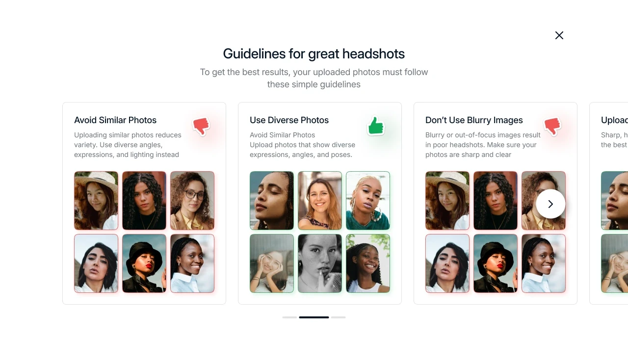
PROGRESSIVE DISCLOSURE · COGNITIVE LOAD
Showing information only when it's needed, instead of all at once, is the whole idea behind progressive disclosure.
TRUST DESIGN · CONVERSION
Answering a user's worry before they voice it is one of the quietest, most effective moves in conversion design.
What changed, and what didn't make it?
The polished version is always the second draft. Or the fifth. Two versions of this flow shipped. The gap between them is where the actual design work lived.
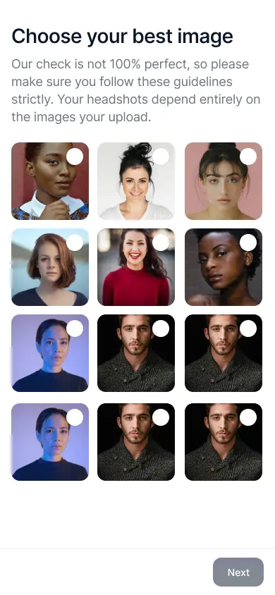
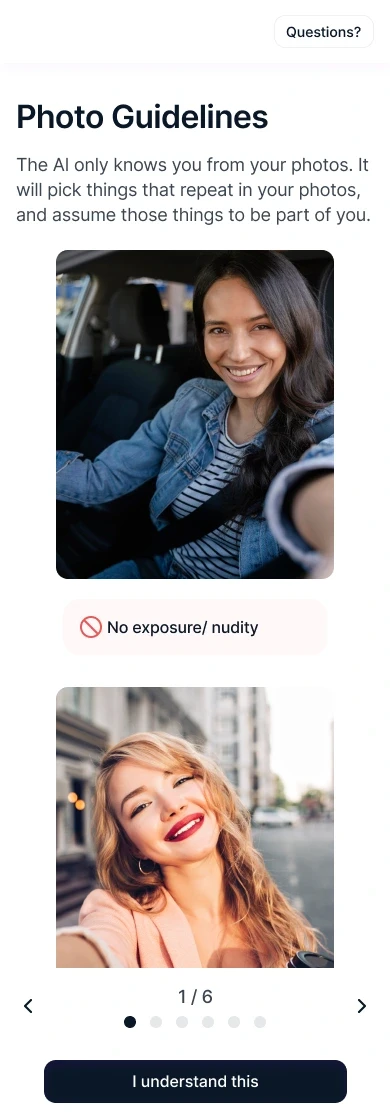
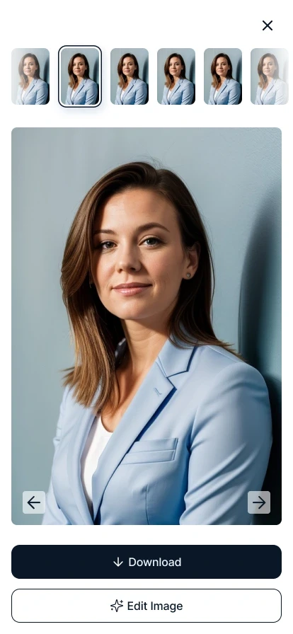
V1 told users the rules. The final version showed them what good looked like. V1 rejected photos with a flat list; the final grouped rejections by reason and offered fixes. Same flow, but the second version treated the user as a collaborator instead of a rule-follower.






What got cut, and why
A lot of early steps asked users for information up front, details about themselves, manual tagging, extra confirmations. Most of it got cut. Once the model was trained well enough, it detected most of that automatically. The friction we'd carefully designed became friction worth deleting.
The bravest design decision in an AI product is often removing the thing you built last month, because the model finally outgrew it.
So how do you actually make a stranger trust you?
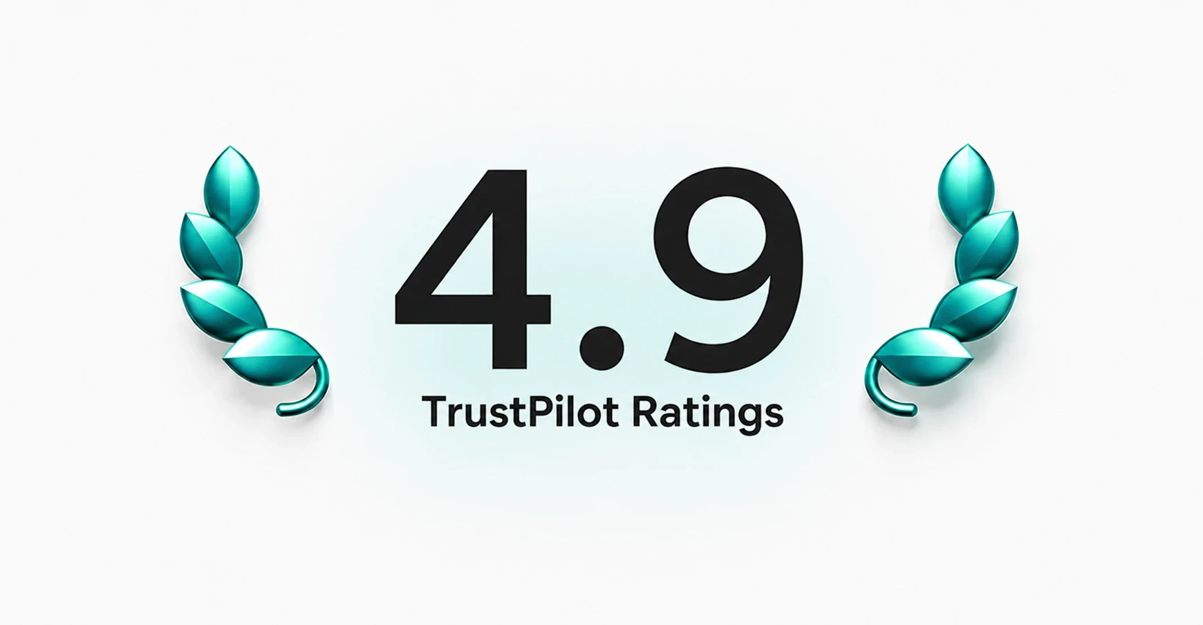
13,000+ reviews.
The proof is public and verifiable. The Trustpilot record: 13,000+ reviews, overwhelmingly positive, with users repeatedly naming the "see your results before you pay" experience as the reason they trusted the product.
"The only headshot service where I could see the results before paying a cent. That's why I trusted it."
— paraphrased from recurring Trustpilot themes
And the strongest signal of all: two direct competitors copied the free-tool model we shipped first. When the two largest players in your category build their version of something you designed, that's the closest thing to a benchmark you get.
That was a design decision. The payment-wall timing, the free results reveal, the honest loader copy, the locked-but-visible upsell, all of it added up to trust, and trust is what the reviews kept naming.
The product scaled to a category leader. The design system I built from scratch carried that scale without a teardown. The creator flow became the primary conversion surface for a product now used by hundreds of thousands of professionals.
Not a bad outcome for a blank Figma file and a three-week sprint clock.
What did users actually say?
Trust Pilot reviews are a real-time usability study at scale. Positive reviews validate decisions. Critical ones show what to fix. Both matter.